In 2017, my collaboration with Phish continued to grow through new merch illustrations. This period gave me space to expand on the whimsical, surreal style that was starting to take shape—characters, landscapes, and playful details that reflected the band’s spirit. These early years laid the groundwork for bigger projects ahead, eventually leading into my first posters in 2019.
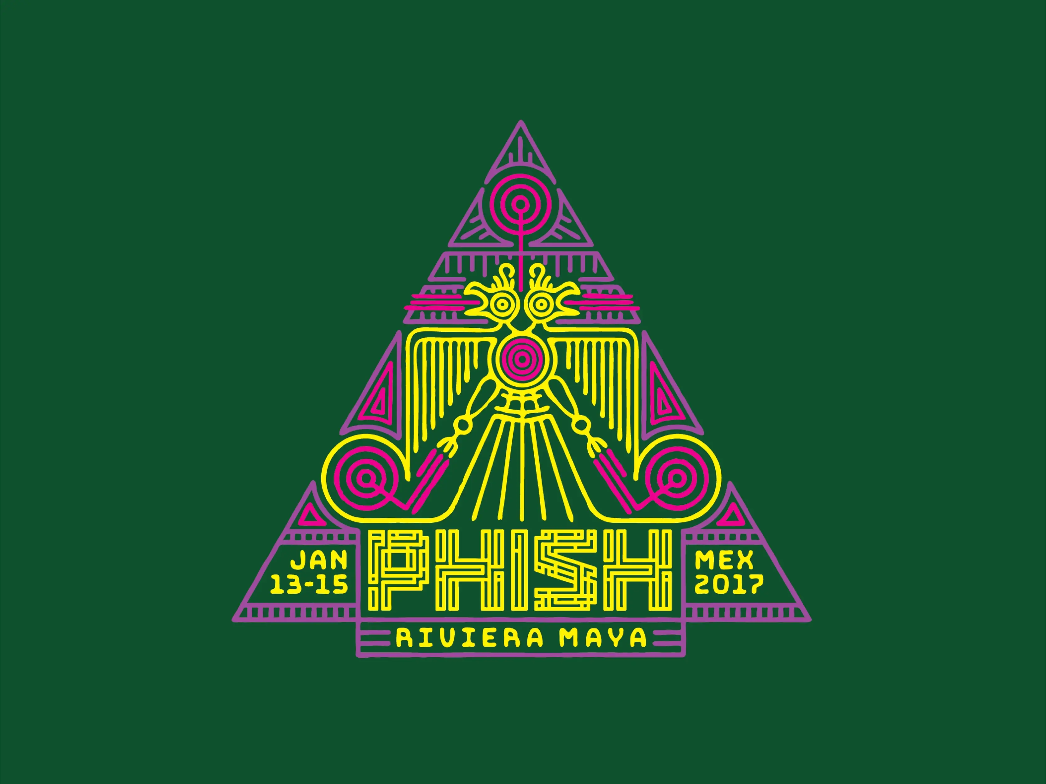
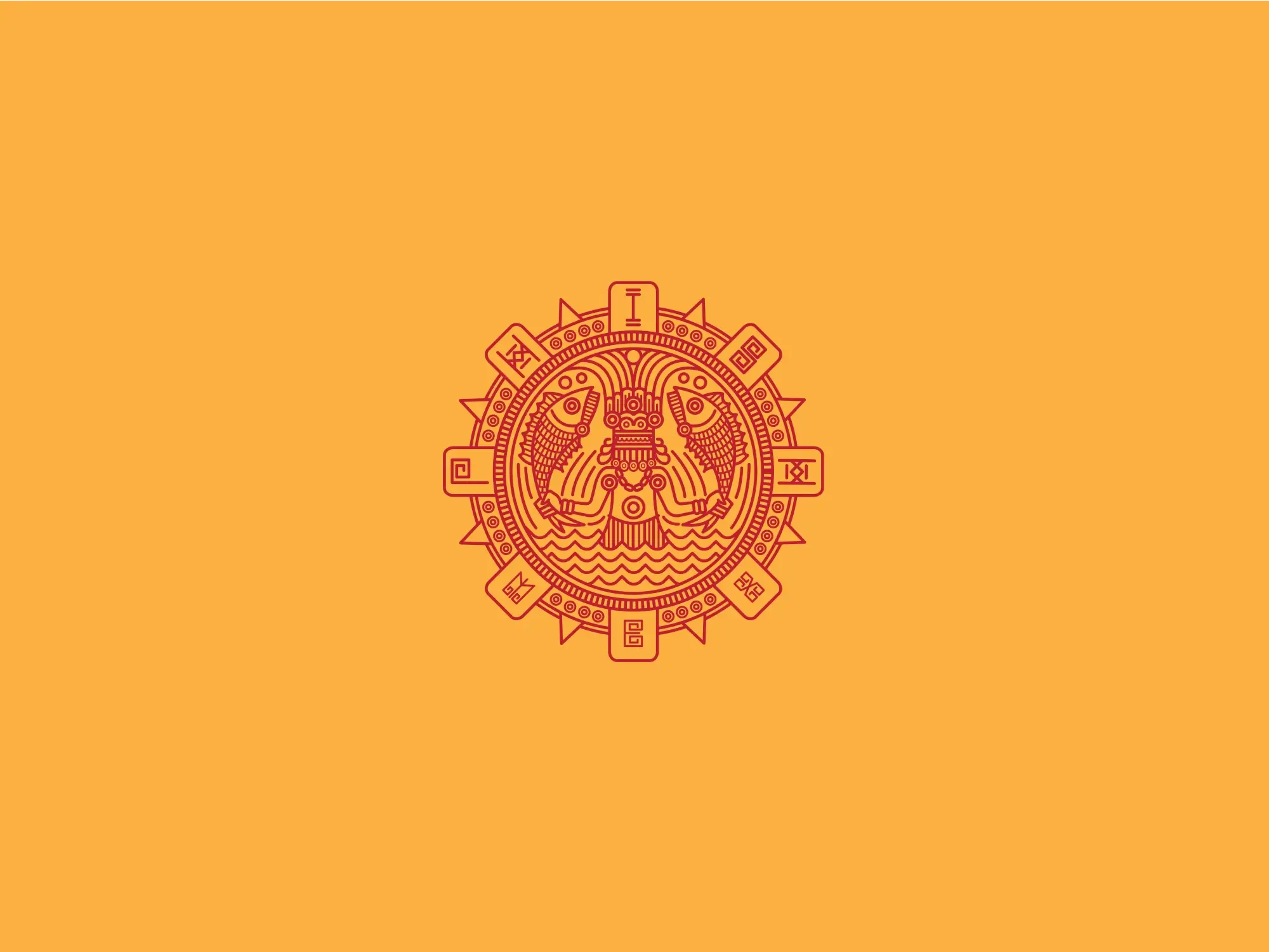
This one is a vibrant fusion of ancient mysticism and psychedelic energy. The central two-headed bird, reminiscent of Aztec or Mayan iconography, symbolizes duality, transcendence, and the ability to see in multiple directions at once. Encased within a bold, triangular temple-like structure, the composition radiates a sense of ritual and reverence, nodding to the sacred connection between music, nature, and community. Also, maze-style lettering to lock in some more Phish reference.
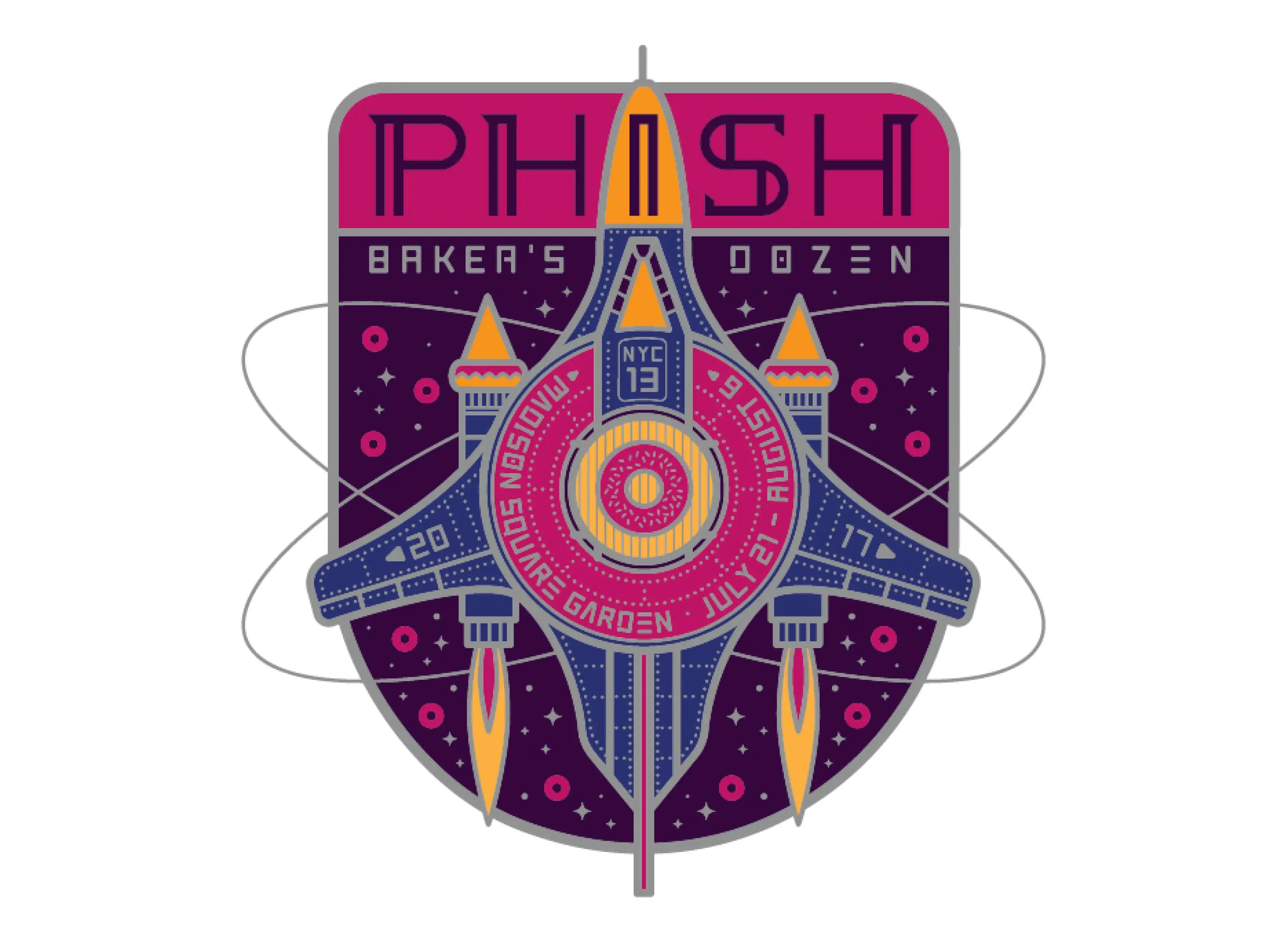
The central spaceship, part futuristic fighter jet, part intergalactic donut-making-station, symbolizes their ability to transcend time, space, and musical convention, taking fans on a journey that’s as unpredictable as it is exhilarating. A doughnut for each show can be seen floating through space with # 13 being baked up on top of the ship.
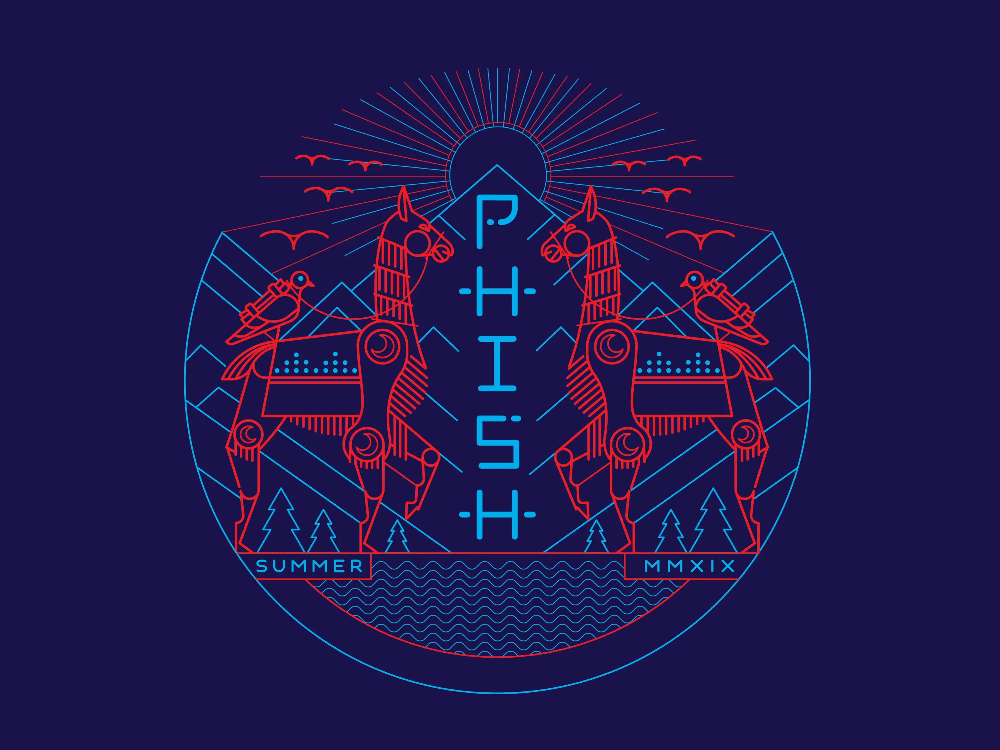
Nothing happened in 2018 with Phish, but in 2019 I was back at it. “Sunrise over the turquoise mountains /Messenger birds in sight / They came up through the valley / Both sides at a time. The lines all working together and I used colors that vibrate. I believe this one was split fountain printed - a technique where multiple ink colors are blended directly on the screen to create a smooth gradient or transition effect in a single pass. Instead of using separate screens for different colors, the inks are placed side by side on the screen and allowed to mix naturally as the squeegee pulls them across the stencil. This results in unique, multicolored prints with seamless color shifts.
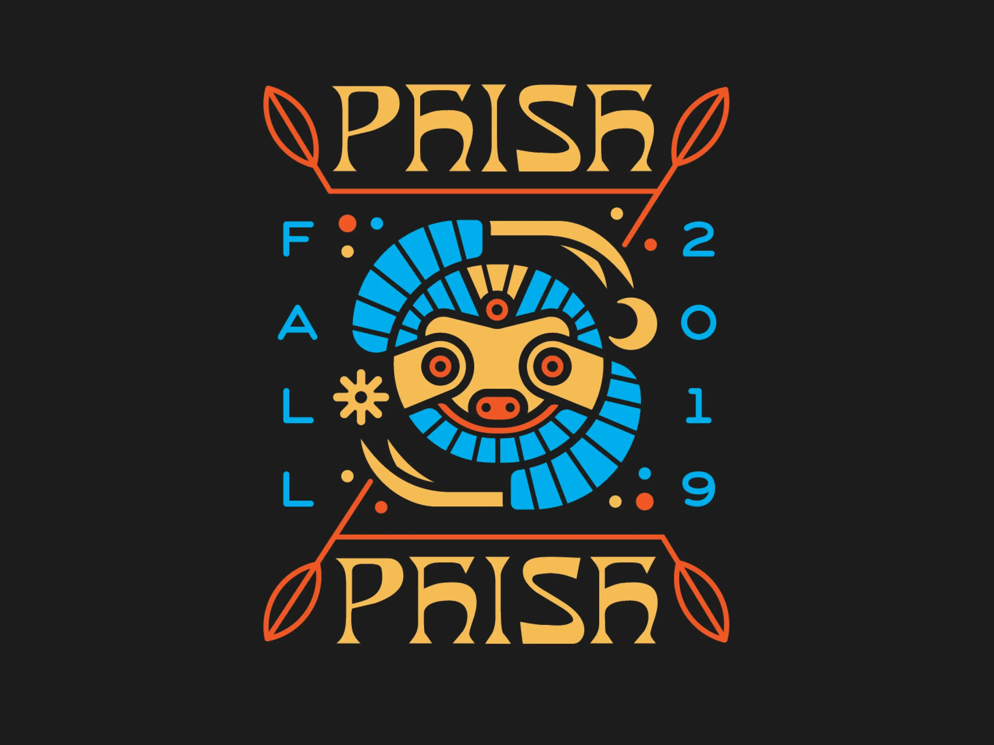
Groovy little sloth illustration for Fall Tour. By fusing the slow-moving, mischievous nature of the sloth with the grandeur of ancient design, this piece captures the balance between looseness and precision, humor and depth—exactly what makes Phish, and their fans, so unique.
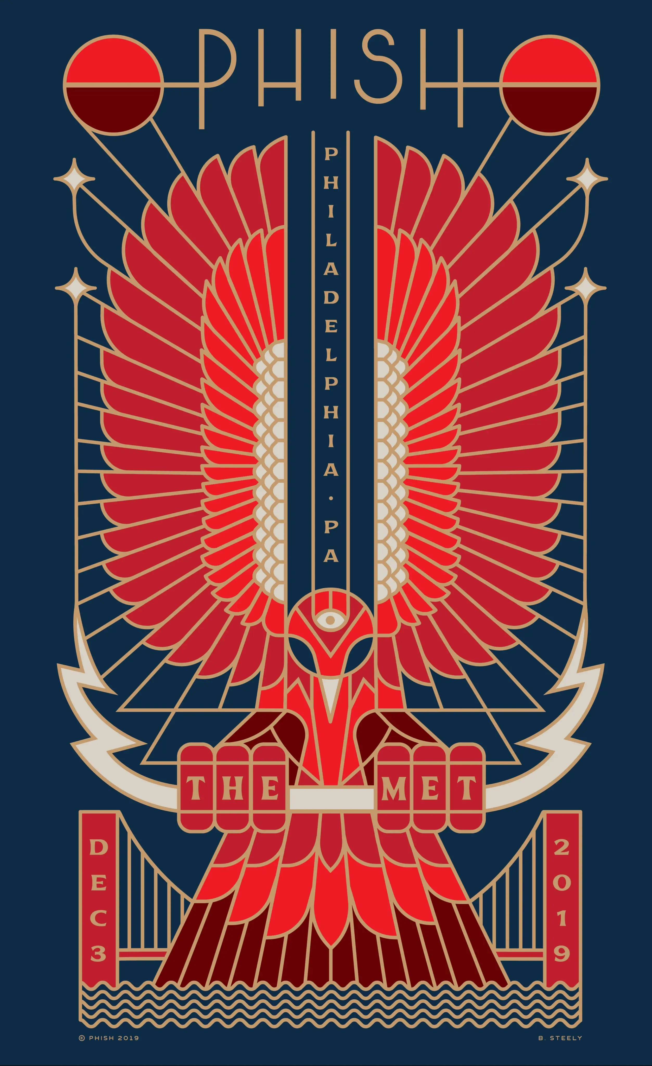
First poster! Still one of my favorites I’ve done. I used the interior shape of the Met to create the wings and built the design out from there. The majestic red eagle, wings fully unfurled, symbolizes rebirth, transformation, and the fiery energy of live music. The central vertical alignment, with the bird’s head positioned at the base of a towering column, creates a sense of ascension. The Art Deco-inspired custom lettering and symmetry evoke the elegance of The Met’s architecture, while the celestial orbs and glowing golden details hint at something cosmic. Like Phish itself, the phoenix rises, the music soars, and the night becomes something timeless. Unfortunately, Sirius sponsored the show which prevented it from being able to be sold as a screen print, but on the flip side, every person in attendance got a nice printed version!2019 The
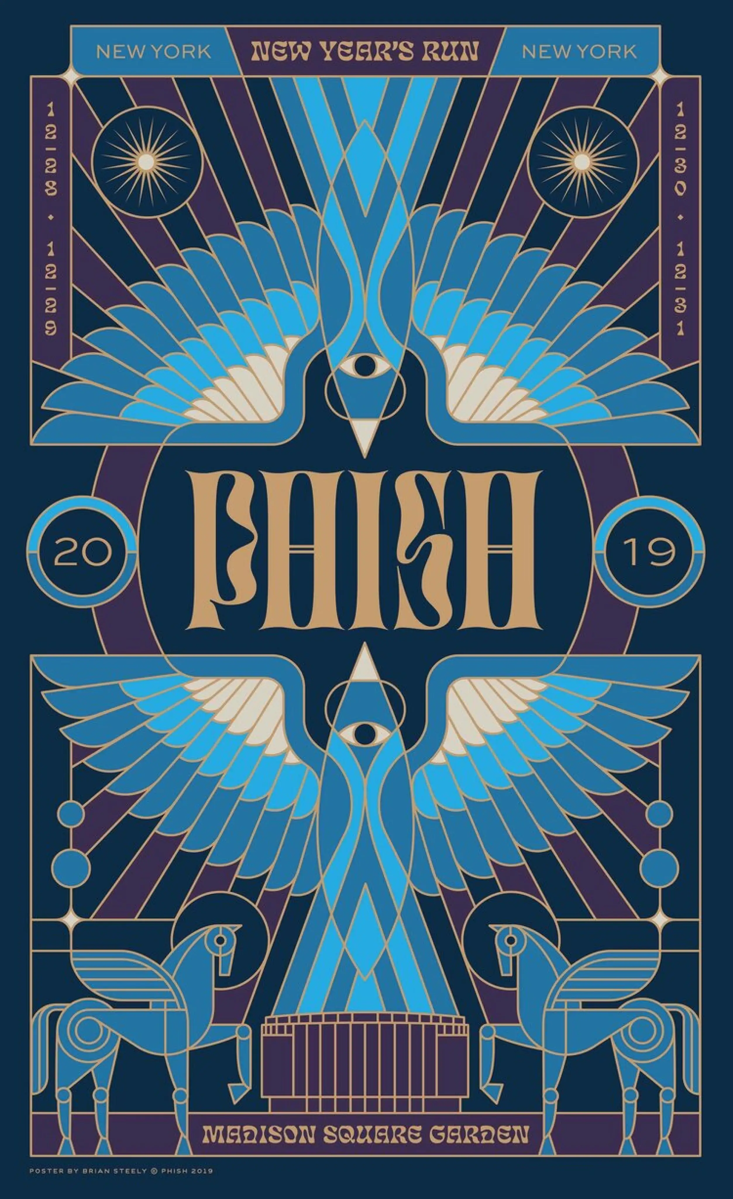
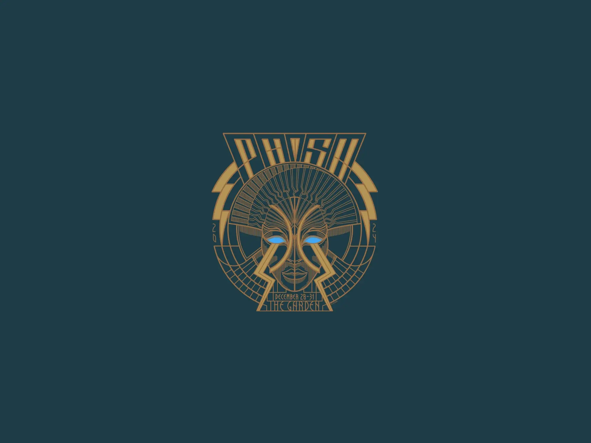
The phoenixes symbolizing symbolizes rebirth, ascension, and the transformative power of music—fitting for a band known for turning each performance into a ritualistic experience. The interwoven eyes reinforce themes of perception and awakening, mirroring the heightened state of awareness that comes with an unforgettable Phish show. Framed by cosmic elements and mechanical horses, the composition blends the mystical with the futuristic, evoking both timelessness and forward momentum—a perfect metaphor for stepping into a new year. The winged horses stand guard, protecting the arena from any bad vibes. We used metallic gold to warm up the cooler colors and give it a more festive vibe. This limited-edition screen print was produced in a run of 1,200 copies.
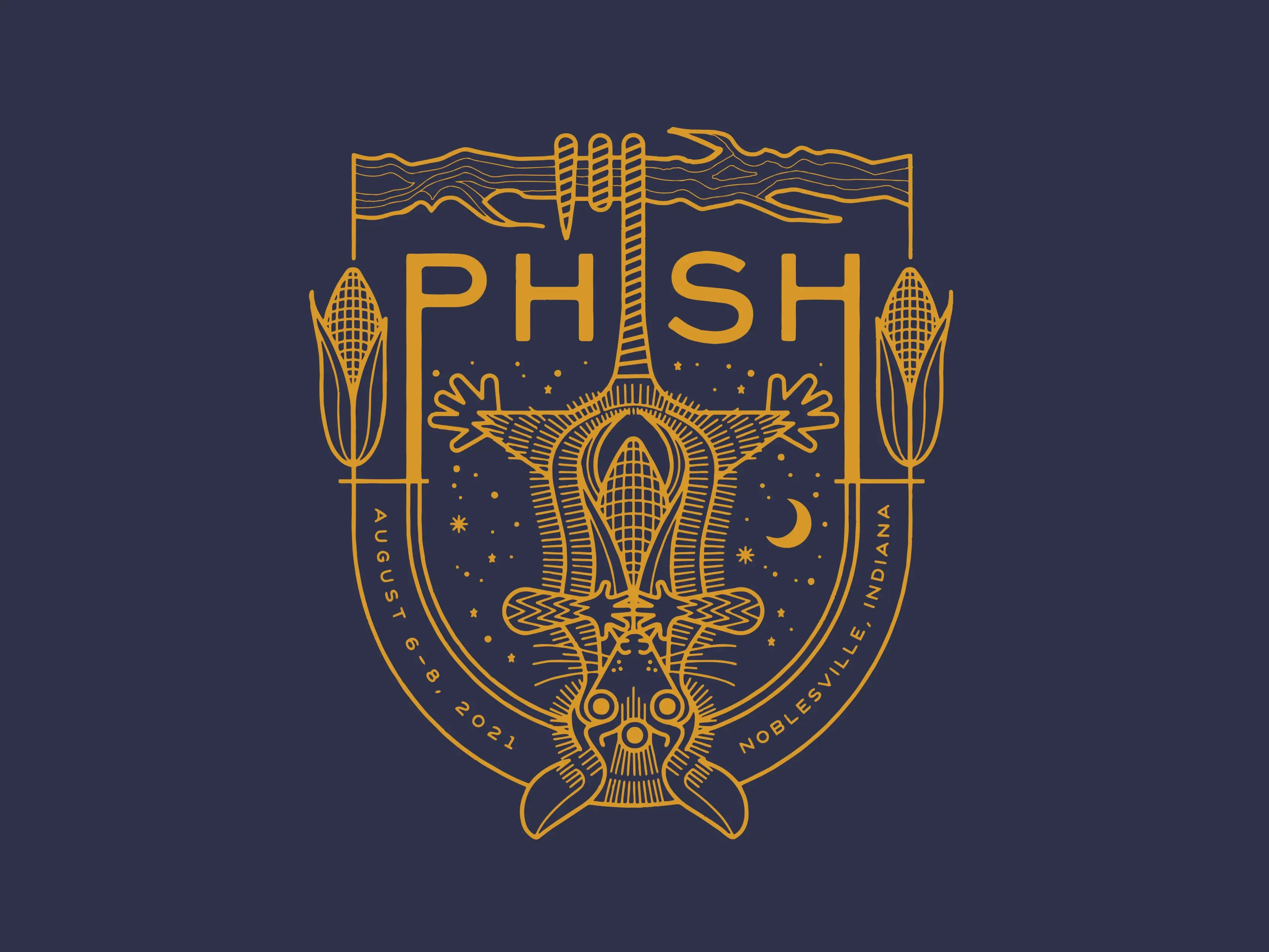
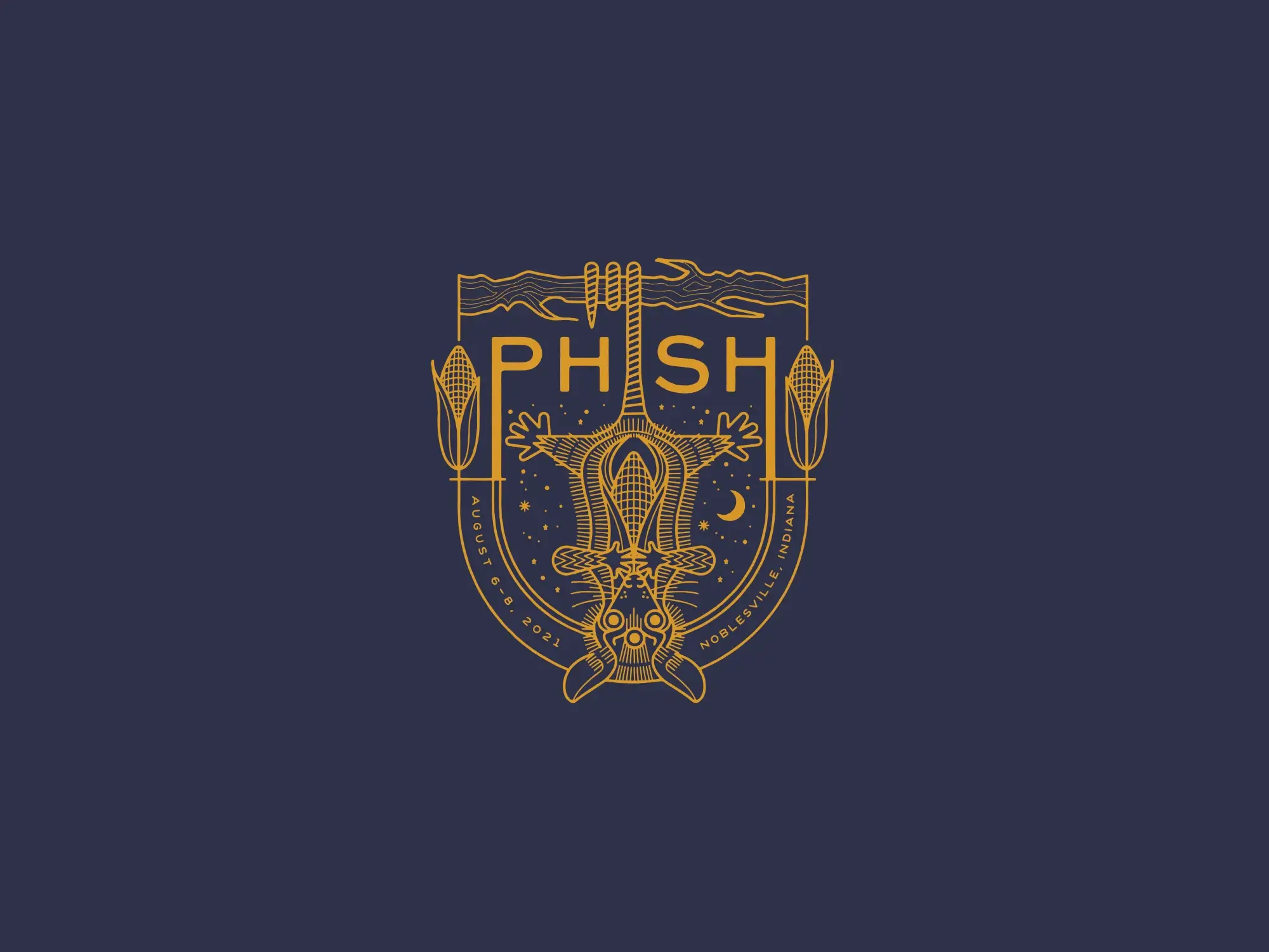
We’ll skip 2020 for obvious reasons and move right on to ‘21. Growing up with songs like Llama and Possum always around me makes the experience of illustrating these extra special. Figuring out how the lettering and illustration can work together is always a fun puzzle to solve. Corn for Indiana, possum for Phish. I love using a rich yellow on top of navy too.