For more than ten years, I’ve had the incredible privilege of working with Phish, helping translate their legendary live energy into visual form. In this three-part series, I’ll share some of the thought and process behind the posters and merch I’ve created along the way—told in a timeline format, highlighting some of my favorite projects. These illustrations draw on whimsical characters, fantastical landscapes, and the occasional third eye, blending abstraction with representation to echo the band’s music and community. Huge thanks to Julia Mordaunt, Phish’s visionary creative director, whose guidance and art direction helped bring these works to life.
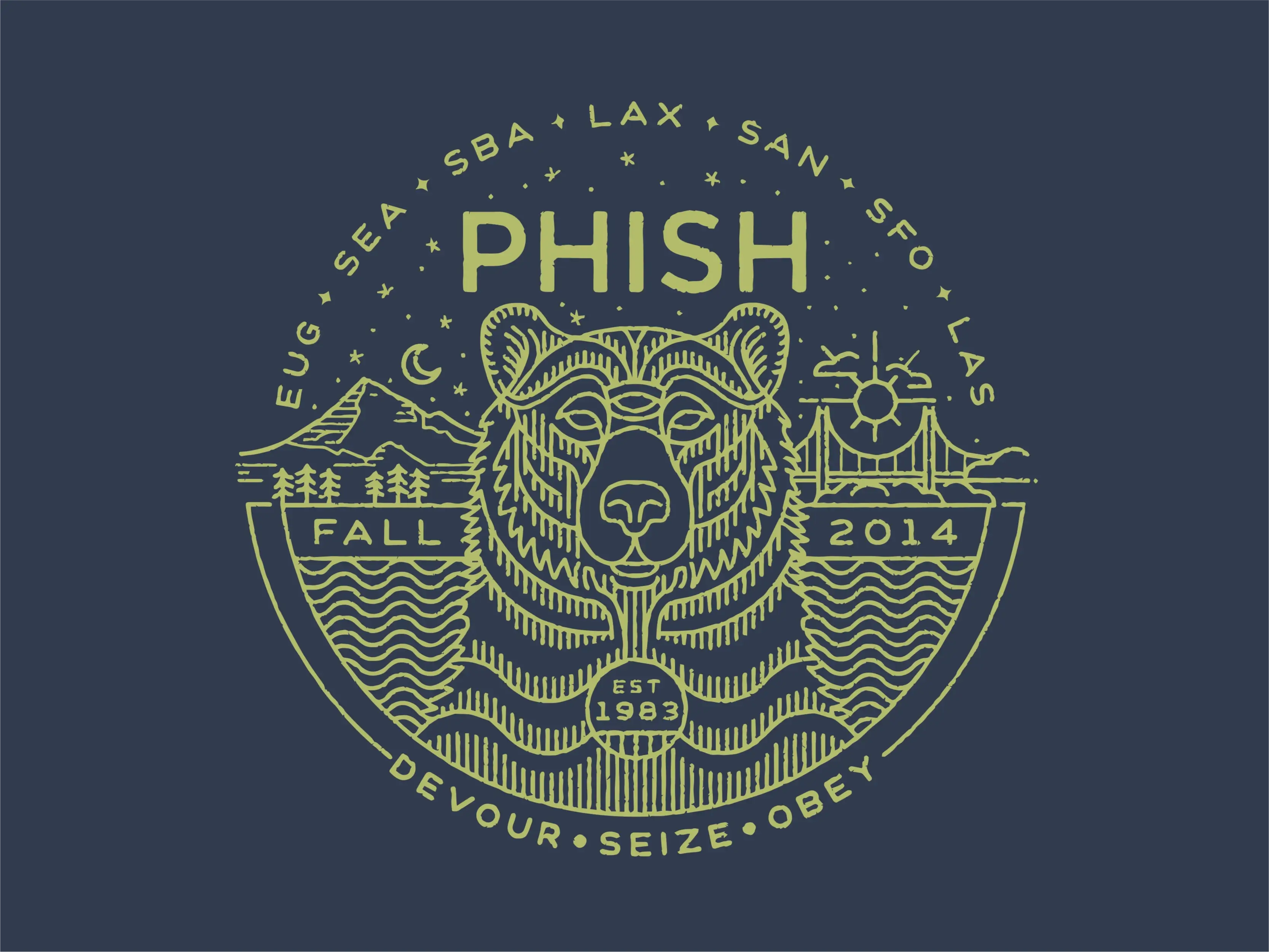
Where it all began for me with the band. This was for a tour starting in Eugene and working it’s way to Los Angeles. Through the linework I tried to convey psychedelic, cosmic, and natural elements. At the center, the bear exudes wisdom and a touch of the supernatural, its intricate linework suggesting movement and transformation. Mt Hood is on one side of the bear and the Golden Gate bridge on the other to help covey the trip. Flowing water and waves echo the band’s improv style—fluid and ever-changing. And at the bottom, the mantra “Devour • Seize • Obey” from Colonel Forbin’s Ascent.
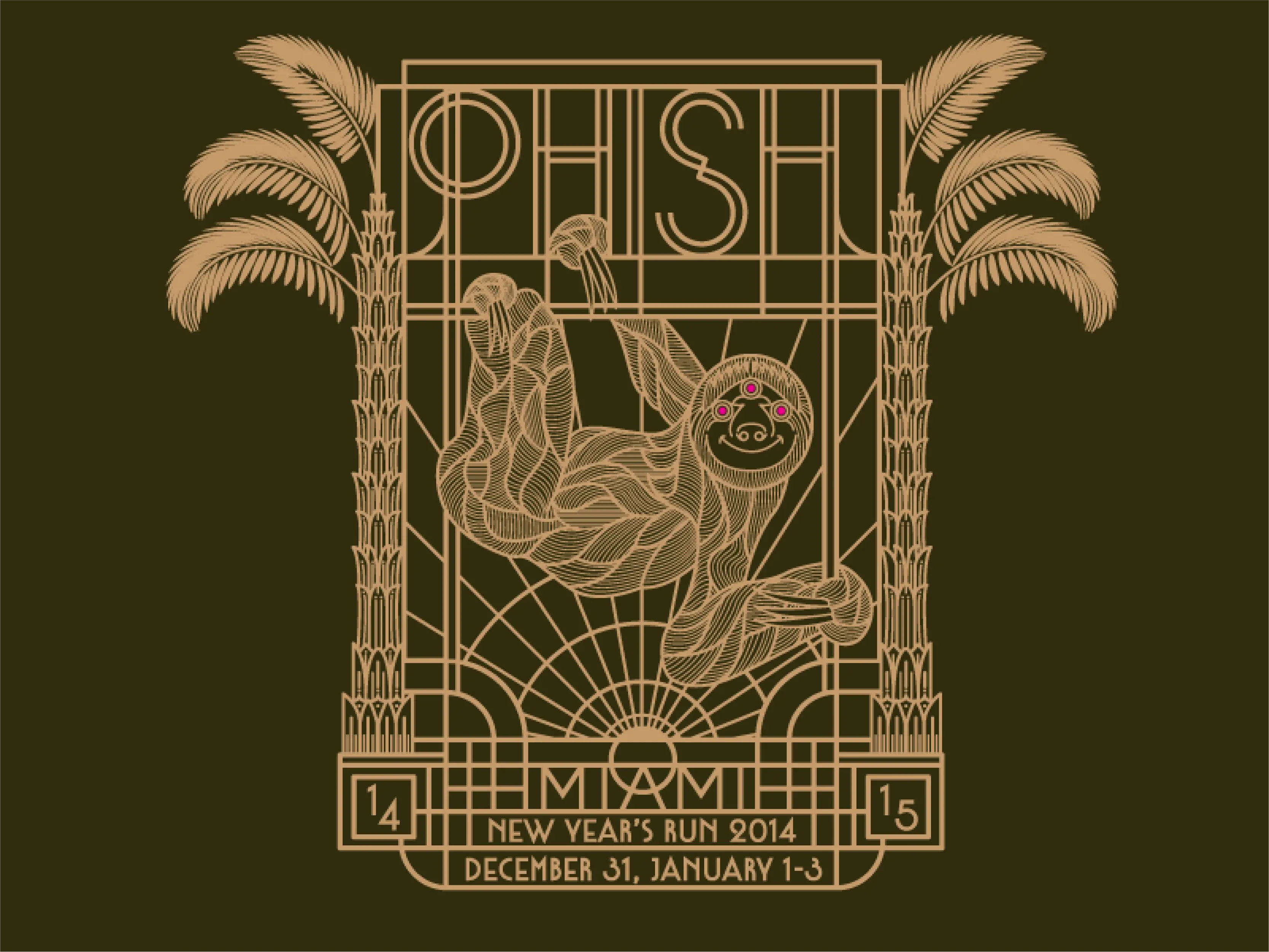
Went for a super art deco vibe with this one and had a lot of fun with the lettering and lines. The symmetrical palm trees and geometric frame pay homage to Miami’s iconic architecture, grounding the design in vintage luxury. But at the center of it all? A grinning, enlightened sloth, hanging in blissful slow-motion with a cosmic third eye and hypnotic detailing. It’s the perfect embodiment of the Phish experience for me - grinning ear to ear.

The antelope runs around spreading the sweet, sweet sounds of Phish. There’s a play button under the third eye and the ears are the speakers. It merges a gramophone with an antelope—a nod to the song Run Like an Antelope. I wanted to use colors that really vibrated for this one. The custom “PHISH” lettering above, with its interconnected lines represents an antenna helping to transmit the tunes. With its fiery red hues and dripping details, the design pulses with energy, evoking the heat of summer and the electricity of their shows.
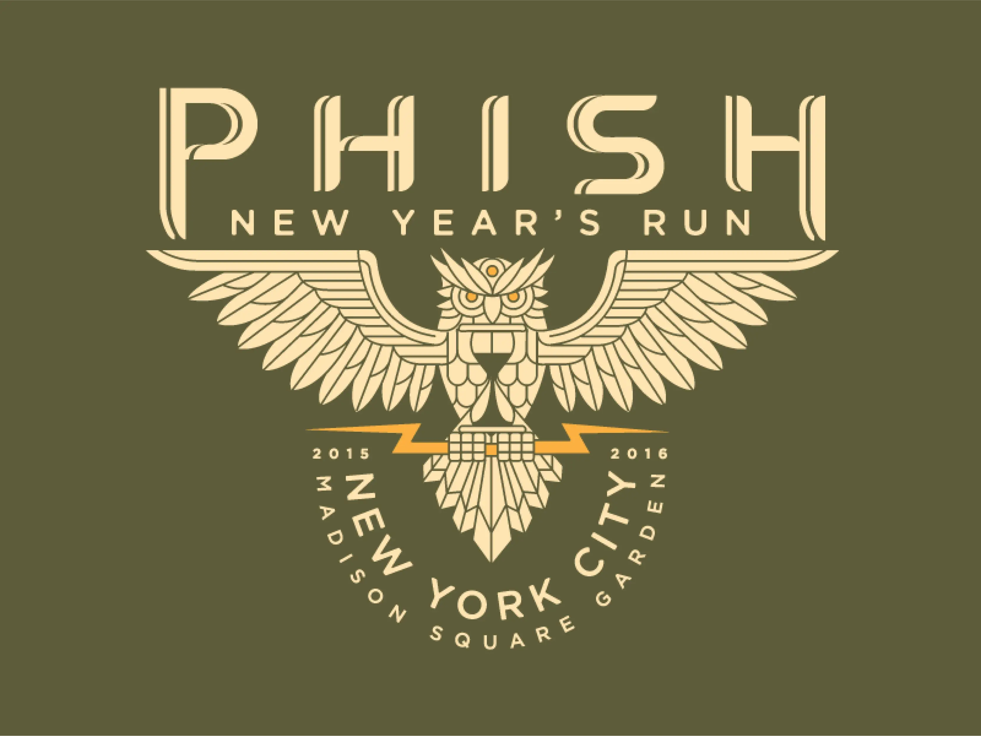
The owl, often associated with wisdom and the nocturnal, is representing time with the hourglass. The hourglass, combined with the owl, lightning bolt, and custom lettering, creates a design that is both timeless and timely, embodying the essence of Phish’s music: a perfect blend of structure, spontaneity, and the magic of the moment.

The illustration incorporates imagery inspired by ancient Mayan culture, such as pyramids, glyphs, and deities, paying homage to the historical and spiritual significance of the region. The surrounding circular design, reminiscent of a Mayan calendar or sun stone, suggests the eternal nature of music, ritual, and cosmic harmony. The numbered glyphs around the edges, with their geometric precision, mirror both the structure of time and the improvisational yet intentional nature of the music.

Unlike the regal eagle, the vulture is a true road warrior: patient, persistent, and always circling for the next feast (or in this case, the next show). The background: mountains, tents, trees, and a starry sky—captures the essence of summer tour life, where the scenery changes but the energy stays the same.
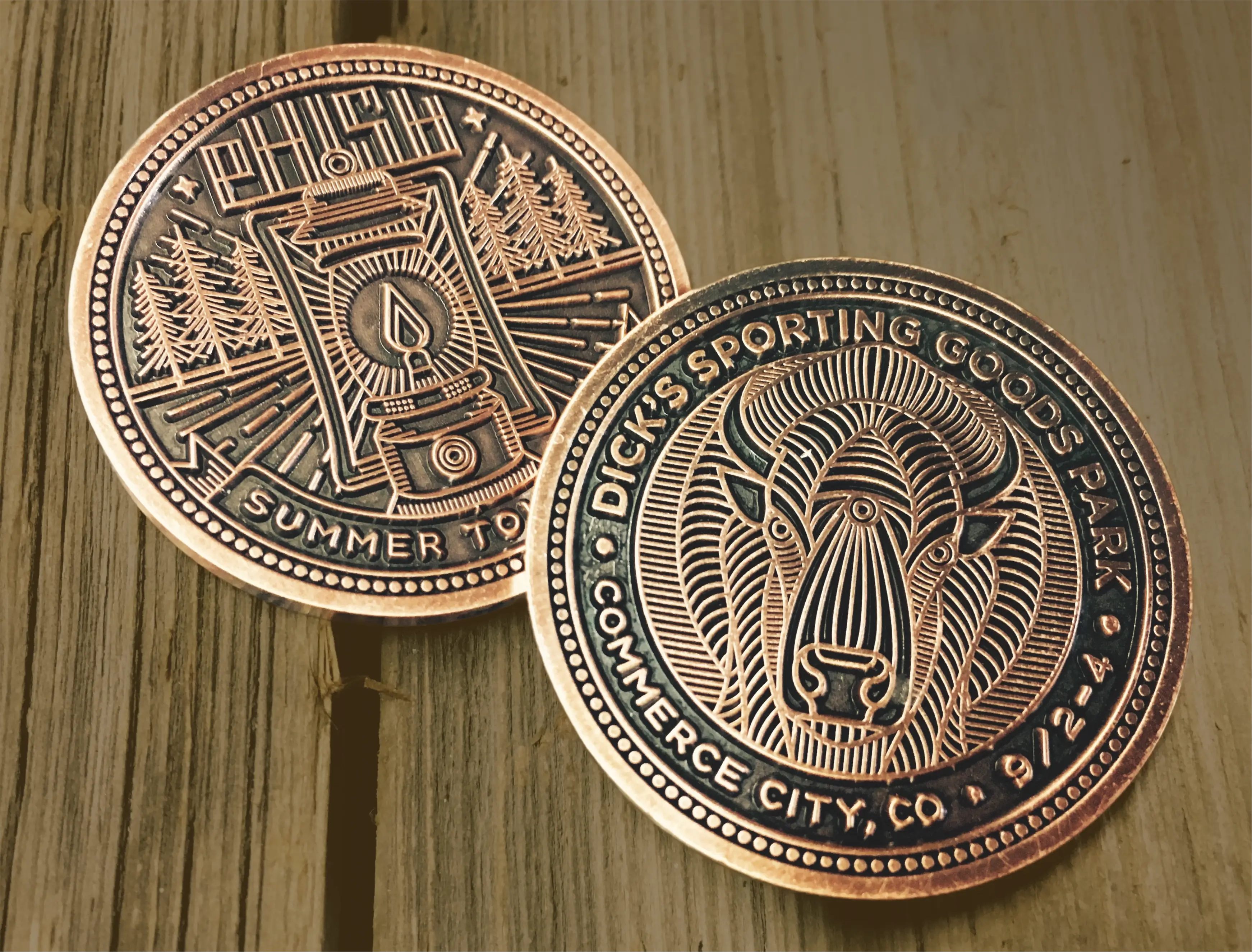
The artwork for the coins features a unique design for each show, inspired by the locations and themes associated with the concert venue/city. Each coin measures 1.5 inches in diameter, is 3.5mm thick and crafted from a brass-zinc composite. It’s always fun to see my work in a different medium and we took home a Communications Art award for these designs.